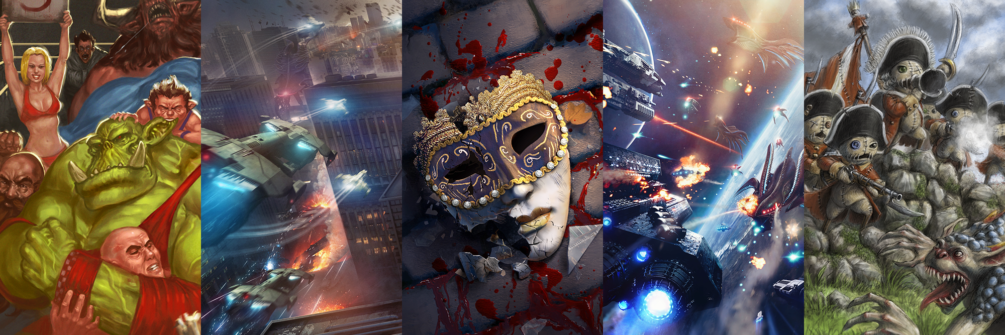
Look at that gorgeous art! Let’s see how it was made.
It’s our last WIP Wednesday of the year! But don’t worry, starting next week, the TTCombat advent calendar will be back! We’ll have teases 5 days a week!
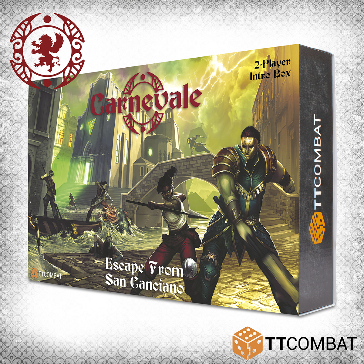
For our last one, we thought we’d let Rei up to the surface of the canal to have a chat about the process of making the artwork for the front cover of the new Escape From San Canciano box.
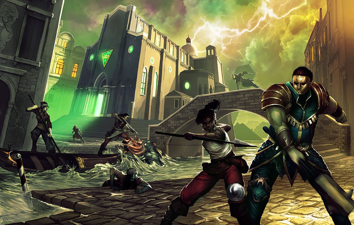
Rei: When starting a piece like this, we first had to note down the elements that are necessary for the cover to do what it’s intended to do, which is to get people interested in the world of Carnevale. It needed to show the clash between the Guild and the Rashaar (this game is all about fighting and jumping off things after all!), It needed to show off San Canciano and the Church of Dagon presence (sunken and creepy) and it needed to display each of the characters in the box, in a way that shows their best angles – a particularly tricky thing in a fight scene!
Lewis: This piece certainly has a lot of elements! Making a box or book cover is always one of the most challenging things. We knew it had to have a gondola (nothing screams “Venice” more than that), and the Rent in the Sky as well. Tight streets and multiple levels were important too. In addition, we wanted to tease the sunken area of San Canciano in the background without it completely getting lost in all the other elements. Not too much to fit in!
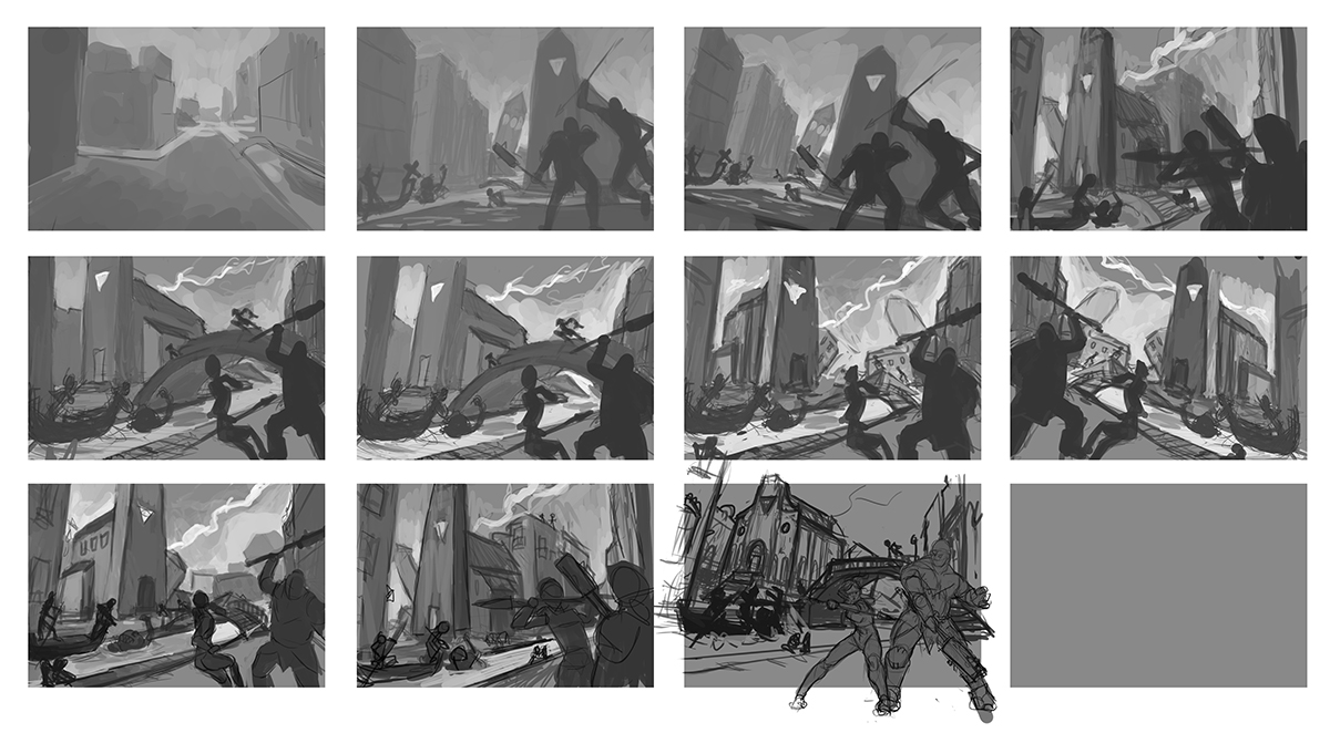
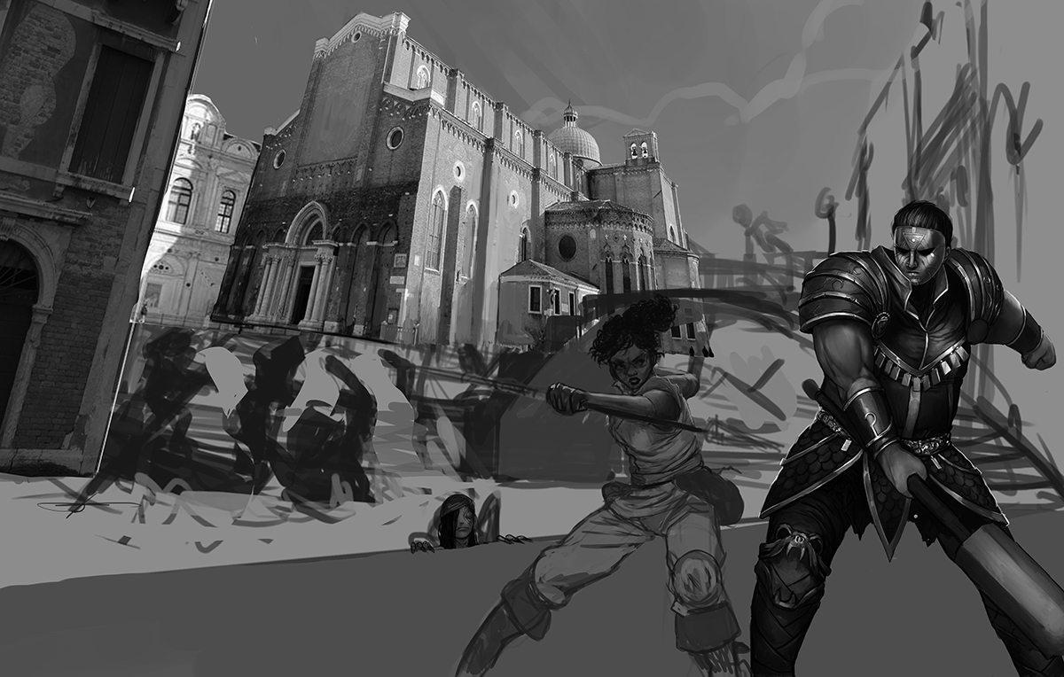
Rei: Thumbnails are always super useful for looking at several different solutions quickly and sort out what works and what doesn’t. Since the focus is fighting, it made sense to have two characters fighting in the foreground, someone that would use melee weapons and would look like they could be an even match (I would like to see a pilferer take down a morgraur as much as the next person, but apparently, I can’t have my way!). One of the most difficult parts was giving all the other characters a good spot where they would shine, without being the main focus of the scene. We also quickly decided that the Church should be central in the scene to really solidify the presence and control the Church of Dagon has on the area.
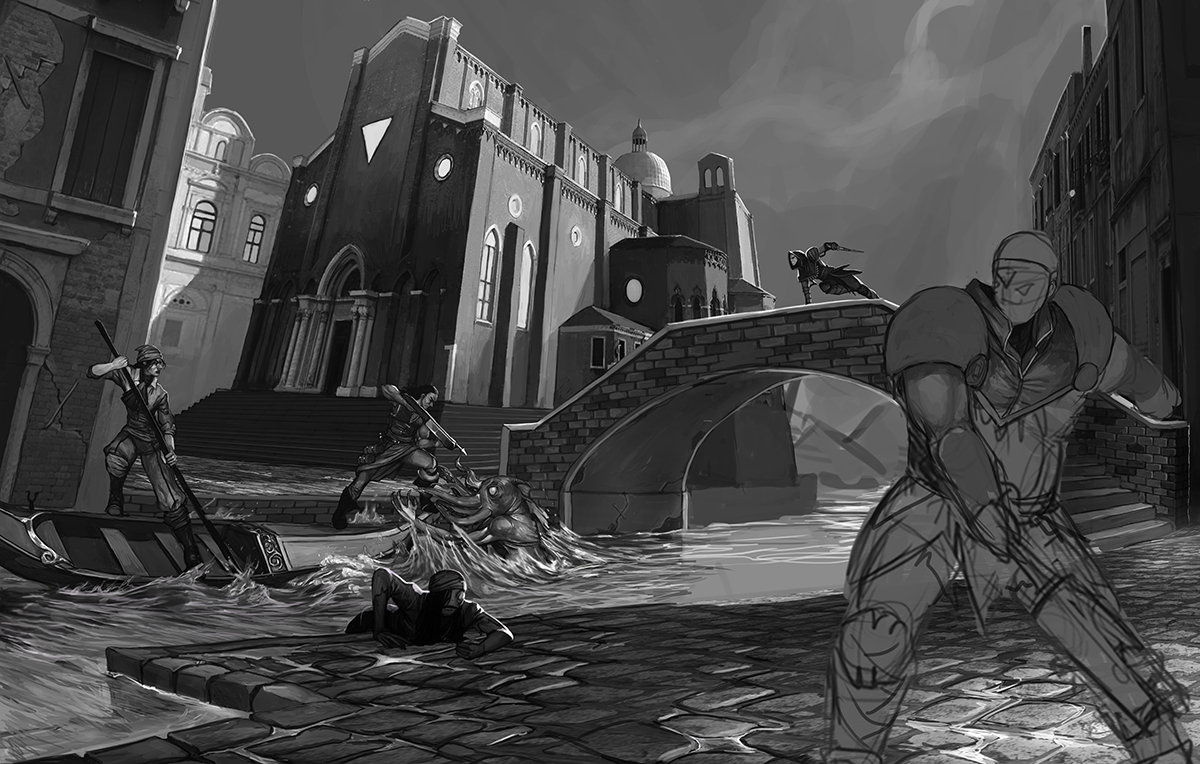
Rei: The next stage is nailing down the composition and perspective. The Church has to look big and imposing and the bridge provided a nice gap to show the sunken areas.
Lewis: That bridge took a few tries to get right! The background here was actually one of the harder elements, since there were so many things that had to be shown. It’s a lot easier for me at this stage since I just get to say “can you add this” and Rei has to worry about the perspective to make it all fit!
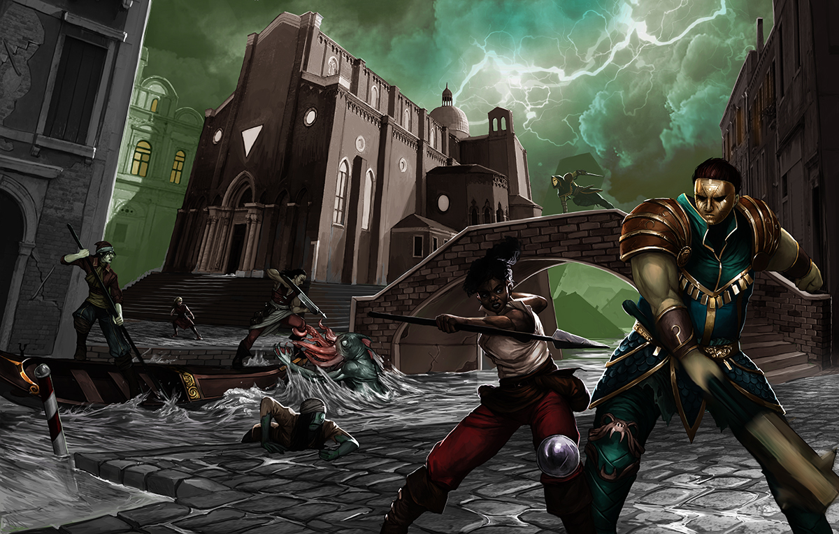
Rei: This is the stage to figure out all the poses and lighting. We had already designed all the characters beforehand for the contents of the box, so it was just a matter of finding their place within the scene and making them fight! We wanted to make all of them interesting on their own, but also to work in the larger setting. In this stage I also brought in some stock images and textures to make my life easier when fleshing out the city of Venice in a believable way.
Rei: Afterwards it’s all about getting the mood right! Getting the greenish blue hue of the Rashaar on everything, to once again convey their grasp on the sector and also for additional creepiness. The Rent in the Sky and the clouds needed to be dramatic to enhance the action and the sense of urgency. The Guild is fighting tooth and nail to escape, they’re definitely out of their element!
Lewis: One of the nice things about the Rent in the Sky is that it appears differently to different people and at different times. So that gives us a lot of scope to make it whatever colour is most beneficial to the scene!
Rei: When all that is done it is just a matter of tweaking and polishing, then tweaking and polishing some more until we have the result we want.
Lewis: And what a result! I think this is one of the best pieces of art we have. You don’t tend to see lots of fight scenes in miniature wargaming art outside of the bigger companies because they’re so time intensive, but we knew we had to pull out all the stops for this one. You look at that art and you can tell exactly what kind of game Carnevale is. There are people running around, fighting each other, the city is in a state, and there’s a tentacled fish monster pulling someone out of a gondola – perfect!
If you’d like this cool piece of art as a desktop wallpaper, click here!
